Sam Jenkinson
http://samjenkinson.blogspot.co.uk/
http://jenkodesign.cagd.co.uk/
https://www.pinterest.com/SamJenko/
Type Screen
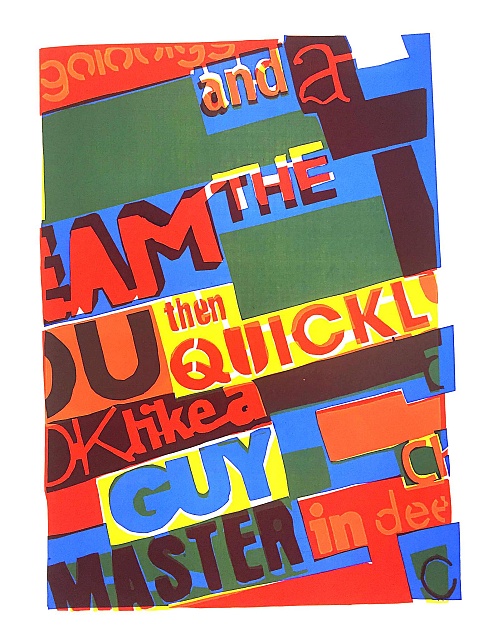
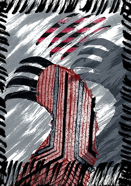
I would call this a description of my work, not because I feel it represents my specialty in graphic design but because I feel it represents how I go about doing all forms of work. This screen print piece in particular because it took me eight stencils to finally to get it to work. I believe this represents me because even though it took so much stress and time but I stuck at it and got in finished to a standard I am pleased with.
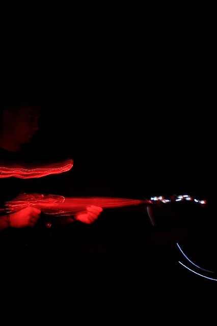
'Hand' Gun

My first experience using a slow shutter speed and drawing with light without using type. I found this incredibly fun we had a laugh playing around and taking different shots and although I really enjoyed myself i feel as though I managed to produce some impressive outcomes, it may have taken a few attempts and a couple of adjustments in terms of lighting and positioning but I am very pleased with my photographs.
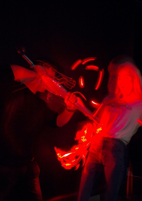
Machine Gun
This is my second image. If you haven't guessed my theme is weapons. Here I am simply holding an umbrella in the stance of a machine gun and have had red light pointed to it to give a great effect! The bullets were created with a flashing bike light moving away slowly from the gun. I really like the contrast between the red and the blue/white bullets I feel as though it really brings the image to life and gives a very serious viewpoint even if we were all laughing and making pretend gun noises!
Stabbing photo
This is the third of my light drawings here I am stabbing Grace with the umbrella that actually kind of looks similar to a medieval sword. The original image was a bit too dark and I thought it was tough to depict the whole idea. I took it into Photoshop and adjusted the levels to enhance my stance and Graces reaction to the stabbing. I really enjoyed light drawing and I'm sure it will come in good use in my future work.
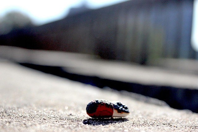
Cigarettes
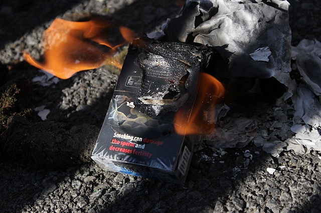
This is a photograph I took with a DSLR camera I feel that it represents the theme weapons in an alternative way to just taking a picture of a gun or a knife. The idea behind the image is, cigarettes are not really a weapon because you cant harm someone other than yourself but then I thought possibly the idea that society sometimes provokes us to get involved with smoking. Everyone knows smoking cigarettes is very bad for your health, as awful as it is and deeply saddening, people can use a gun to end their own life for whatever reason however people by choice buy cigarettes and are potentially using this weapon to kill themselves. Another way I interpreted this image representing weapons is fire. People use fire as a weapon all the time by setting cars on fire or setting a house on fire in some cases even businesses, these are arsonists. I enjoyed using photography to represent my theme although it is hard to get hold of weapons!
Illustrator Shapes

The aim of the game here was to create three shapes in Adobe Illustrator that were not recognisable as default shapes. After creating the three shapes I then had to place them in a composition that I felt really worked well together. I made a few compositions thinking about the balance and some places juxtaposing shapes next to each other but this, The first composition I kind of did by accident as the present layout was actually the same just spread out to the edges of the canvas. In my head I think it looks like a shark eating a rubber duck, I actually really like this because I was simply playing and my mind managed to spot some potential in the shapes and actually created a representational image.
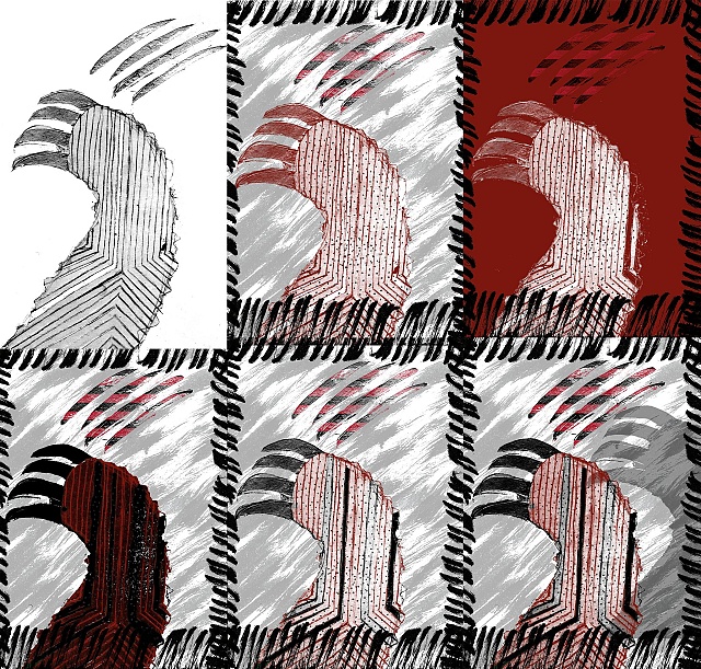
Bear Claw
Originally this image was a dry point I made but I scanned the plate I used on to the computer and then used it in the photoshop tutorial we did and began to experiment a bit at home as well. I played with levels, Gradients, masks, clipping masks, opacity, the channels and lots of other tools. I like the idea of the claw but I actually prefer the composition and the balance. The shadow I used was just a copy of the main claw filled in with the paint bucket and a low opacity, I then simply moved it to the side and slightly raised. Took little time and effort but I think it really casts a strong vibe over the image relating it even more stronger to my theme, Weapons.
GOTH TYPE
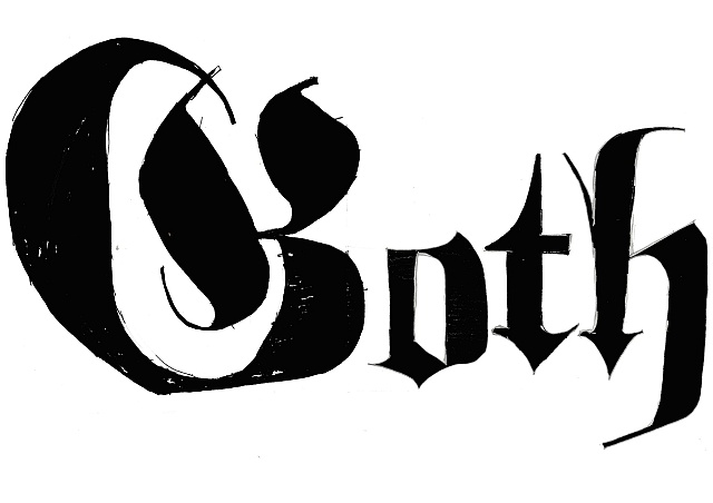
My touched up version of my Goth type in the style of Fractur. When I was drawing this I found it pretty difficult to get to grips with the anatomy of this typeface purely because it pretty much makes up its own rules, for example in Arial the lower case 'h' does not have an descender but for some reason in Fractur it does. Even though I dislike how it has its own rules, I do like how it still manages to work with such bizarre rules to its anatomy.
Paracetamol
This is part of my pictures brief. I took this picture because I was thinking of drug abuse and even though it is just a simple paracetamol used for minor pain relief, people have and do abuse these. The point I am making here is the burning of the drug is like our personality and our souls being burnt away. I used the urban scene and background because I feel that it is society that pushes us into these dark places and we get lost in the city and the culture surrounding it.
Hammer Textures
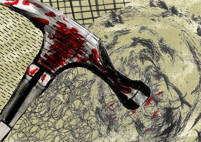
Here is a composition I created in response to the weapons brief. I used photoshop to bring together my hammer drawing and all of these lovely textures. I created the simple mouldy white background by using a paint brush in photoshop. The hammer itself i drew during the pictures brief. I like how it has come together and the hammer is hanging off the page. I think the textures in some ways marry with the movement of the hammer. Impact being all cracked and distorted behind the hammer lines to insinuate the speed and direction of the hammer moving.
Double Dutch

Double Dutch: Using a selection of foreign sentences I chose one and composed over 10 outcomes. this is by far my favourite because I feel as though I really nailed the positioning and balance of the letters. Using a sans serif typeface it allows it to become very easy on the eye when placed in very structured, almost constructivism positions. I like the way the juxtaposed 'n' draws your eyes in and sits perfectly on the 'e' in 'Roetine'.
Bear Claws Edits
This is practically the process of my photoshop editing with my bear claw. Starting with what I felt needed work progressing through to what I think works well. Was originally a lino print and I scanned it in to photoshop. A couple of these were in fact accidental. I would be trying new things messing with methods and tools I had only heard of before, I actually preferred my print to my photoshop edits but I also feel something was missing in my raw print. I will have to go back and create another plate maybe including a shadow feel or maybe extend the brief to something of a more 'hunting or hunted' vibe.
HAIKUU Poem

This is my Haiku Poem. It took me a couple of attempts to get it right but now I feel like it really expresses what I want it to in quite an understanding way and works well when read out. 'Wartime in the air' for me is more of a situation where you do not need to visualise the scenery but you sense everything else. The smell of gun powder the ringing in your ears the taste of dirt and sweat the imagination of the other feelings gives a much more understanding feeling. 'Bodies Bleed In The Silence', this really hits home with the emotions and gives us a real sense of what the people in no mans land are experiencing. 'Hills Mirror The End' tells more of a parallel story meaning that the hills could be maybe the end and standing watching over the hills, it also could relate to the hills of bodies that they are surrounded by with their emotions flying around trying to make sense of the monstrosity they have just experienced.
No Mans Land
This is the video for my Haiku poem, I use my own voice that I recorded in the bathroom in order to create an echoed effect. This was the first time I have ever used Stop Motion Animation and I really enjoyed it. I think this works with the grittiness of my theme of war and no mans land. I found it challenging to get my poem right at first but I stuck at it and I am really pleased the outcome. The stencil is the left over paper from my a2 poster of my haiku.
Porkpies
This is mine and Terences outcome for the Sound, Image and Text brief. We analysed the audio file and determined that the voices were so amazing and typical that their voices alone would be enough to illustrate. The story is about a husband and a wife who are overweight and have received surgery to lose their weight. they talk about their emotions and their new diet. We illustrated each bit to what we felt would be their imagination on an image roll, with a focal point of focusing on pub type on a chalk board. I really enjoyed this brief and feel it has worked out well. I also had an amazing time working with Terence whilst having a laugh and enjoying the work.